Blog
Insights on impactful designs
Expert perspectives, creative trends and actionable insights to elevate your design journey.
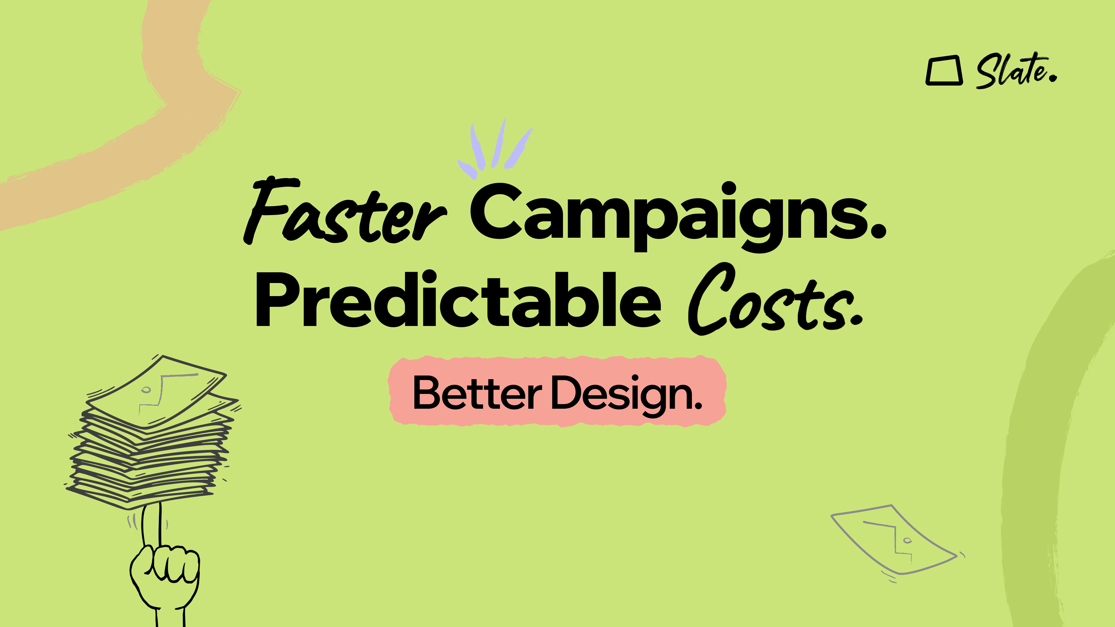
The Brief Is Clear. So, Why Does the Design Keep Missing the Mark?
Graphic DesignJun 5, 2026
By Susan Thomas
How Creative Design Services Boost Marketing ROI Without Hiring a Full Team
Graphic DesignMay 19, 2026
By Susan Thomas
Design as a Service in 2026: Why Subscription-Based Graphic Design Services Are Replacing Freelancers for Startups?
Graphic DesignMay 7, 2026
By Susan Thomas
Branding & Identity on a Budget: How Design Subscription Services Deliver Pro Results for SMBs
Graphic DesignApr 30, 2026
By Susan Thomas
Why the Best Marketing Teams Rely on Design Subscriptions in 2026
Graphic DesignApr 28, 2026
By Susan Thomas
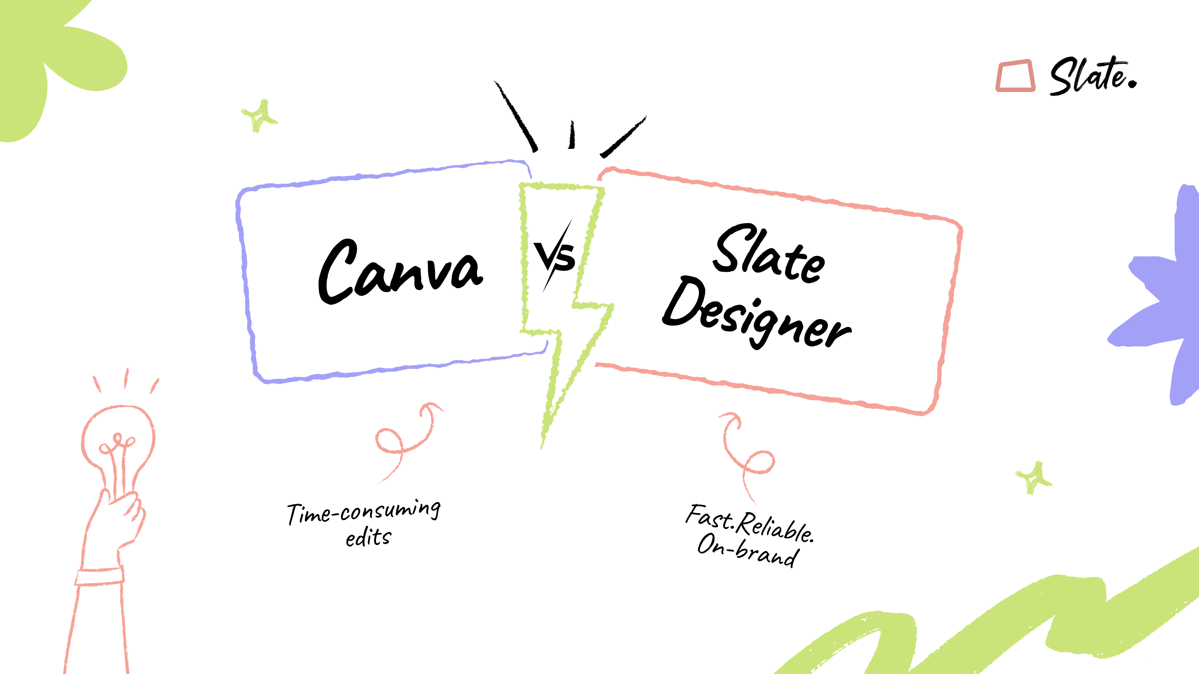
Canva vs Slate Designer: Why a Design Subscription Service is Better for Growing Businesses
Graphic DesignApr 23, 2026
By Susan Thomas