Feb 23, 2026
Web Design
The web is getting louder and more expressive than ever. Think about the last website you admired. Scroll through platforms like Dribbble, and you’ll see where design is heading: bold color palettes, oversized typography, layered visuals, motion-heavy layouts.
Maximalist web design is expressive, immersive, and visually ambitious. It pushes brands stand out in a crowded digital space. Yet many of these showcase-ready designs would struggle to meet Web Content Accessibility Guidelines (WCAG) 2.0 Level AA requirements. That gap between visual ambition and accessibility compliance is where real UX challenges begin.
After years of minimalism, white space, muted tones, simplified layouts, designers are embracing personality again. If you work in UX or web design, you’ve likely felt this shift.
In this guide, we’ll walk you through what digital accessibility means in a maximalist context, where common problems arise, and how you can design boldly without excluding anyone.
Let’s begin.
Why Accessibility Matters More Than Ever
Before we talk about maximalism, let’s pause and look at the reality of the web today.
According to the WebAIM Million 2023 report, 96.3% of the world’s top one million homepages fail at least one WCAG 2 accessibility criterion. On average, each homepage contains 37 accessibility errors.
That means accessibility is already a challenge, even before we add complex animations and layered visuals.
Now let’s look at the human side of this.
More than 1.3 billion people worldwide live with a disability, according to the World Health Organization. That’s a massive part of your potential audience.
Research from Tenet shows that 73% of users with disabilities leave a website if it is difficult to use.
In 2024, 4,914 digital accessibility lawsuits were filed in the United States, according to UsableNet.
Accessibility directly impacts your reach, user satisfaction, and business performance. If your website is not accessible, you are limiting who can engage with your content, products, and services.
Designing with accessibility in mind ensures your website works for more people and supports long-term usability and compliance.
When Bold Design Creates Hidden Barriers
Maximalist web design is bold, expressive, and visually unforgettable. It embraces:
Strong, high-energy color palettes
Animated and kinetic typography
Parallax scrolling and layered motion
Dense imagery and visual stacking
Experimental display fonts
Unconventional navigation patterns
Done well, this approach creates energy and emotional depth. It differentiates brands in a sea of sameness.
However, each of these elements can directly conflict with accessibility standards if implemented carelessly.
The goal is to ensure your creativity works for everyone, including users who rely on assistive technologies, keyboard navigation, screen readers, or reduced-motion settings.
The Five Common Fault Lines in Maximalist UX
Here are the five most common ways maximalism can break UX, and how you can fix them.
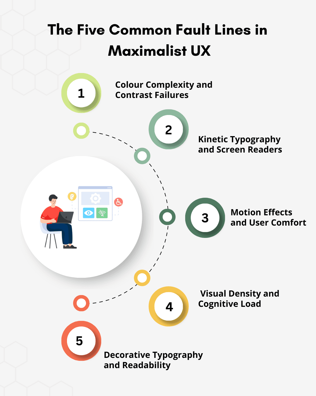
1. Colour Complexity and Contrast Failures
Maximalist web design often depends on saturated palettes, layered gradients, and bold color pairings to create energy and brand distinction. Visually, these combinations can be compelling. Functionally, they frequently fail accessibility standards.
Under WCAG 2.2 guidelines, normal body text must meet a minimum contrast ratio of 4.5:1 against its background. Large text must meet 3:1. In practice, color contrast accessibility remains one of the most common accessibility failures across the web.
Low contrast directly impacts:
Users with low vision
The estimated 300 million people worldwide with color vision deficiencies
Older users experiencing age-related vision decline
Anyone viewing content on mobile devices in bright environments
If your text looks beautiful but is hard to read, users will struggle, and leave.
What you should do
Test contrast ratios before finalizing brand palettes
Adjust brightness, saturation, or layering while preserving visual identity
Prioritize legibility for core content, navigation, and calls to action
Bold and accessible can coexist. With structured testing and intentional color decisions, they can work together.
2. Kinetic Typography and Screen Readers
Animated headlines are popular in maximalist design. Text that moves, reveals itself letter by letter, or changes as users scroll can look impressive. But many of these effects break the semantic HTML structure.
Screen readers rely on proper HTML structure to interpret meaning. When text is fragmented into dozens of animated elements, assistive technologies may read characters out of order, repeat content, or fail to announce it entirely.
For users relying on screen readers, your most important message might simply disappear.
Best practice:
Preserve semantic HTML structure at all times
Use CSS animations or transforms without restructuring meaningful content
Avoid splitting text into individual character elements unless ARIA techniques preserve readability
Test animated content using screen readers such as NVDA and VoiceOver before release
If assistive technology cannot interpret your content accurately, it does not meet accessible web design best practices.
3. Motion Effects and User Comfort
Parallax scrolling and layered animations create depth and immersion. But for some users, they create discomfort. People with vestibular disorders can experience dizziness or nausea from motion-heavy interfaces.
Accessibility standards require that moving content can be paused or reduced.
What responsible UX looks like:
Implement prefers-reduced-motion.
Design a reduced-motion state intentionally.
Ensure animated content can be paused or controlled.
4. Visual Density and Cognitive Load
Maximalist layouts often contain multiple focal points, patterns, and moving elements.
While this can feel exciting, it can also overwhelm users, especially those with ADHD, autism spectrum conditions, or cognitive processing challenges.
Even neurotypical users may feel overloaded when navigating complex interfaces.
How you can improve this:
Maintain a clear visual hierarchy.
Separate primary actions from decorative elements.
Use whitespace strategically.
Keep navigation consistent and predictable.
The more expressive your design becomes, the stronger your structure must be.
5. Decorative Typography and Readability
Display fonts and experimental typography are central to maximalist aesthetics. But they must be tested beyond desktop design previews.
Over 92% of global internet users access the web via mobile devices. A headline that looks striking at full desktop resolution may become cramped or illegible on smaller screens. The same issue appears when users zoom to 200 percent, which supports low-vision accessibility and is required under WCAG compliance in web design.
If typography does not scale, accessibility fails. Users struggle to read, scanning slows, and comprehension drops.
What you should check:
Test typography at 320px viewport width
Test at 200 percent browser zoom
Pair expressive display headings with highly readable body fonts
Maintain sufficient line height and spacing
Avoid rendering meaningful text as images
Readable typography is non-negotiable. It is foundational to accessible user experience design. Expressiveness can define your brand. Legibility determines whether your message is understood.
Principles for Accessible Maximalist Design
Maximalist design increases visual complexity. Accessibility requires structural clarity. When both coexist, precision becomes essential.
If you are designing within maximalist aesthetics, apply these principles intentionally.
1. Prioritize Contrast Before Finalizing Color
Test color combinations against WCAG 2.2 contrast requirements before locking brand palettes. Adjust saturation, tint, or layering without compromising readability. A vibrant interface must still meet the 4.5:1 contrast ratio for body text.
2. Preserve Semantic Structure Behind Every Animation
Kinetic typography and motion effects must not break semantic HTML. Animate presentation through CSS while keeping meaningful content intact for screen reader compatibility and assistive technologies.
3. Make Motion Optional
Parallax, auto-scroll effects, and kinetic transitions should respect reduced-motion preferences. Implement user controls and system-level motion settings to support inclusive UX design.
4. Separate Decoration from Core Structure
Place visual richness in non-essential layers such as backgrounds, illustrations, and texture systems. Navigation, headings, forms, and calls to action must remain structurally clear and keyboard accessible.
5. Maintain a Strong Visual Hierarchy
Maximalism increases cognitive load. Clear hierarchy reduces it. Use scale, spacing, and alignment to guide attention intentionally. Every competing element increases decision friction.
6. Test with Real Assistive Technologies
Automated tools detect only a portion of accessibility issues. Validate experiences using screen readers such as NVDA or VoiceOver. Test keyboard navigation accessibility manually. Accessibility in maximalist web design requires real-world validation.
7. Ensure Typography Scales Across Contexts
Evaluate display fonts at 320px viewport width and at 200 percent browser zoom. Pair expressive headings with readable body fonts. Avoid embedding meaningful text as images.
8. Keep Navigation Predictable and Consistent
Unconventional layouts can support brand identity, but navigation patterns must remain consistent. Predictability supports task completion, especially for users relying on screen readers or keyboard interaction.
Accessibility Defines the Future of Bold Design
Accessibility in maximalist web design is not a secondary checklist item. It is a core requirement within modern web design principles. Visual intensity without structural clarity reduces reach, weakens usability, and creates compliance risk under established web accessibility standards.
Accessibility also shapes broader web design topics, including cross cultural design in web design and sustainable web design. Inclusive interfaces respect linguistic differences, reading patterns, device variability, and long-term performance considerations. Accessible systems are easier to maintain, scale, and evolve.
When you align expressive aesthetics with WCAG compliance in web design, inclusive UX design becomes a strategic advantage. You build experiences that perform across devices, assistive technologies, and diverse user needs.
The future of maximalist web design accessibility belongs to teams that design boldly, test rigorously, and treat accessible user experience design as a core design principle, not an afterthought.
Design Boldly. Build Accessibly. Lead Responsibly.
The brands that succeed will be the ones that treat accessibility in maximalist web design as a strategic advantage.
At Slate, we help you create visually expressive digital experiences grounded in inclusive UX design and WCAG compliance in web design. Our team builds scalable, accessible UX systems that support creativity without compromising usability, performance, or accessibility standards.
Whether through monthly professional graphic design services or unlimited web design services, we create high-performance digital experiences aligned with modern web design principles.
Work with us to:
✔️ Design visually rich interfaces that meet web accessibility standards
✔️ Build structured, scalable systems aligned with WCAG 2.2 guidelines
✔️ Strengthen screen reader compatibility and keyboard navigation accessibility
✔️ Balance brand expression with accessible web design best practices
✔️ Future-proof your digital presence with sustainable, inclusive design systems
Whether you are reimagining your brand or refining a complex interface, we help you design boldly while ensuring every user can engage, navigate, and convert.
Explore our Web Design Services → Our Services
Ready to elevate your accessible user experience design?
Let’s build it together….Get in Touch
Disclaimer: All visuals used belong to their respective owners.
Talk to Our Design Experts
Talk to our experts